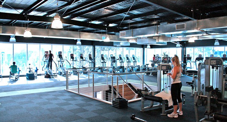
On a recent trip to an out-of-state conference, I was lucky to have friends in the area who offered me a couple of free guest passes to their gym. I gratefully accepted the passes and had several terrific workouts at that facility — but I wished I could have blindfolded myself while there. Although the staff were friendly, the instructors top-notch, and the machines and equipment state-of-the-art, the facility itself was so visually and aesthetically displeasing that it felt oppressive to be in there. I couldn’t wait to get back to my own beautiful, thoughtfully designed gym.
Soon after that experience, I found an Athletic Business article by Rob Bishop and Barry Klein about classic health club design blunders. Bishop and Klein, contributors to the magazine and owners of Elevations Health Club in Scotrun, Pennsylvania, offer advice based on their own past mistakes and successes and their observations of clubs they’ve visited. “When it comes to great architecture and design at fitness facilities,” they say, “we defer to former Supreme Court Justice Potter Stewart’s standard for obscenity — we know it when we see it.” “Obscenity” may be too strong a word to describe the mistakes some facilities make, but the points Bishop and Klein pick up on are spot-on.
1) First, they say, you have to allow for more space. This was a big issue at my friends’ gym: It felt so cluttered with machines, kettlebells, medicine balls, mats, and equipment that working out there made me feel claustrophobic. I compared it with my gym back home, which has a huge room lit up by skylights that, aside from supplies and equipment neatly lining one wall, is practically empty. This is the room where functional training takes place, and where large gatherings or big Zumba classes sometimes happen. There’s so much that can be done with it — but you don’t even know what you can do with a room like that if it doesn’t contain any open space. Bishop and Klein recommend eliminating old equipment (especially when you bring in new stuff).
2) They also make a strong case for choosing the right carpet. Bishop and Klein learned from a mistake they made in one of their own clubs when they decided to lay down single-colour carpeting in some places. In a short period of time, the carpet acquired a worn and dirty look that seemed impossible to vacuum or shampoo away, or merely to hide. As they put it: “Have you ever noticed how industrial carpet typically has lots of patterns and colours? There’s a reason for that….” A multicoloured one might have more of a busy feel than you want, but it will appear much cleaner for much longer.
3) They make a strong case for investing in decent lockers, even if it means “investing a bit beyond your initial comfort level.” Lockers, like front desks and group fitness rooms (and unlike equipment and carpets), stay in place for a long time. Rather than install pieces reminiscent of high school gym class, put some thought into what’s aesthetically appropriate for your club. Let your members feel like grown-ups.
There are other elements to consider too: ceilings, sinks and countertops, lighting. I’d add one more: Make sure your front-desk staff greets members with a warm smile. That goes a long way toward helping to create an environment that people want to work out in — and might even make up for some physical deficiencies inside your facility. The bottom line is this: Audit your facility to determine whether it needs a facelift. Figure out what funds you can allocate to a redesign (if you don’t have much available, focus on just one element you could improve). And take the steps necessary to make changes. Your members (and their guests!) will thank you if you do.
Photo by www.localfitness.com.au
